EDDL 5131: Assignment 1: Source a Piece of Media

Hi everyone,

-Psychological Theory-

Learning Outcome

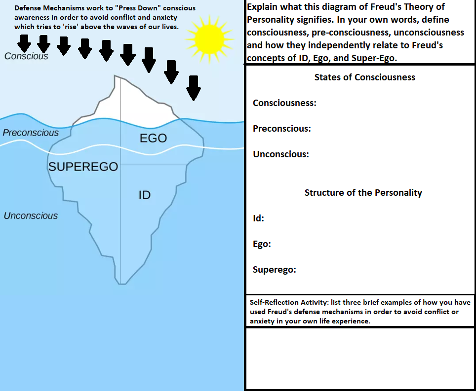
Students will be able to identify, understand, and differentiate between Freud’s concepts of the id, ego, superego, and their associated levels of consciousness.

Goal

In this activity, you will explore Chapter 14 of Psychology (Wade et al., 2015) which will help you to complete the provided end of unit quiz.

  1. Focus on Freud’s Theory of Personality.
  2. Understand and differentiate between consciousness, pre-conscious, and unconsciousness.
  3. Understand and differentiate between Freud’s conception of id, ego, and superego.

Scope

As you read Chapter 14, please consider the following questions:

  • Does acknowledging the existence of unconscious forces matter? Is acknowledgement of the unconscious enough to resolve inner conflicts?
  • What do you think Wade et al., (2015) means when he writes that our conscious intentions have less power over our personalities than our unconscious motives?
  • Which defense mechanisms do you see occurring in your own behavior?

After you have completed the required reading, please view the attached quiz below, and re-visit the questions above in order to answer the quiz questions in your own words.

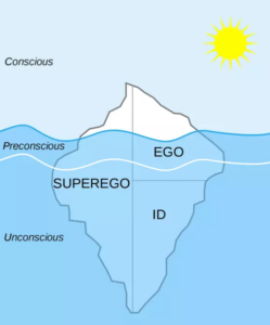
Diagram of Freud's Theory of Personality
Creative Commons Attribution-Share Alike 4.0 International

Note: it is also expected that you will provide brief examples of how you have used defense mechanisms in order to avoid conflict or anxiety in your own life.

Timings & Submission Location

It is expected that you complete the required Ch. 14 textbook reading by the end of Unit 2 with the completion of the attached quiz by the end of Unit 3. The reading and quiz should take you no longer than 3 hours to complete. Please submit the quiz into the drop box by the end of Week 3.

Conclusion

I enjoyed this assignment as it enabled me the opportunity to remix a piece of media I found through a Creative Commons search which re-routed me to Wikipedia Commons where I found this original piece of media below:

Creative Commons Attribution-Share Alike 4.0 International

According to the Wikipedia Commons site, this piece of media is Creative Commons Attribution-Share Alike 4.0 International which allowed me free reign to remix and adapt the image through the use of Paint 3D so long as I provided appropriate credit. I felt that by turning the original media into a quiz that I was able to not only add additional visual content pertaining to defense mechanisms but also challenging and self-reflective questions for the first-year psychology students to consider.

Best,

Carson 🙂

References

File: Diagram of Freud’s Psychoanalytic Theory of Personality .WEBP. Wikimedia Commons. (n.d.). Retrieved February 15, 2022, from https://commons.wikimedia.org/w/index.php?curid=84506706#filelinks

Wade, C., Tavris, C., Saucier, D., & Elias, l. (2015). Psychology (4th Canadian ed). Pearson Canada.

EDDL 5131: Week 5/6: Activity 8: Outline a Student Graphics Activity

black and white image displaying black pencils and the word "Design" in bold letters

Hi everyone,

Introduction

While I have taken a brief reprieve from publishing psychological and spiritual articles on sparrowsoftruth.com, I nonetheless share in supporting the psychological and spiritual learning of others on this website on occasion. I intend to create an activity where learners can create a graphic to demonstrate their understanding of narcissistic personality disorder. My graphic creation activity is designed to be completed within 2 hours.

Learning Outcome

Upon completion of this graphic creation activity, students will have learned how to conceptualize and create a graphic which best represents a minimum of 3 primary facets of narcissistic personality disorder.

Activity Description

Goal

Create an infographic explaining three characteristics of narcissistic personality disorder and their deleterious effects on psychological well-being within human relationships. Your infographic should be conceptually reinforced through one reading of the provided texts of MacKenzie (2019) or Durvasula (2015).

Scope

The size of your infographic should fit within a 960 x 720-pixel Google Draw document. Before beginning this task, ensure that you understand and focus on including Mayer’s (2014) coherence principle, Dunlap & Lowenthal’s (2016) principle of immediacy (p. 47), and Clark & Lyons (2010) focus on organizational graphics (p. 18). You are free to exclude relational and interpretive visuals as this creative project is qualitatively designed rather than focusing on quantitative or biological aspects of narcissistic personality disorder (Clark & Lyons, 2010, p. 19).

Boundaries

This graphic design activity is designed to be completed at the individual level of study. You are free to create an entirely new piece of graphic content or remix an online infographic insofar as the infographic is Creative Commons licensed.

While I recommend that you use Google Draw due to its ease of use, you are free to use Inkscape or Sumo Paint. Keep in mind that your graphic need not be graphically extravagant. Rather, my expectation is that you will be able to create a graphic which is logically coherent, concise, and capable of evoking attention for the purpose of illustrating the deleterious relational consequences of narcissism within relationships (Dunlap & Lowenthal, 2016, p. 47-48).

Timings & Submission Location

It is expected that this creative design activity will only take roughly 2 hours to complete. While there is no Drop Box for submission, you are free to send me your completed infographics through my websites contact form.

Technical Tutorials

Google Drawings Tutorial

Sumo Paint Tutorial

Inkscape Tutorial


Best,

Carson 🙂

References

Clark, R. C., & Lyons, C. (2010). Graphics for learning : Proven guidelines for planning, designing, and evaluating visuals in training materials. Center for Creative Leadership.

Dunlap, J. C. & Lowenthal, P. R. (2016, September 8). Getting graphic about infographics: Design lessons learned from popular infographics. Journal of Visual Literacy, 35(1), 42–59. https://doi.org/10.1080/1051144X.2016.1205832

Mayer, R. E. (2014). Multimedia instruction. In J. M. Spector, M. D. Merrill, J. Elen, & M. J. Bishop (Eds.), Handbook of research on educational communications and technology (4th ed., pp. 385-399). Springer Science & Business Media. https://doi.org/10.1007/978-1-4614-3185-5

EDDL 5131: W5/6: Activity 6 & 7: Situate an Educational Graphic Within Online Learning (with ALT Text)

study

Hi everyone,

-Drama of the Amygdala-

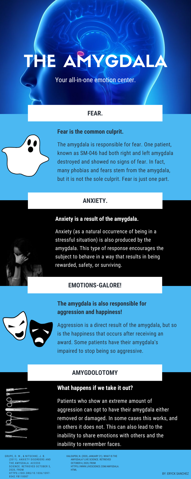
Blue, black, and white psychology infographic describing how fear, anxiety, anger, and happiness are produced through the amygdala's chemical responses to the human environment
The amygdala is the all-in-one emotional center of the human brain. Attribution-Non Commercial-Share Alike 2.0 Generic (CC BY-NC-SA 2.0)

Learning Outcome

Upon completion of a brief study of the amygdala infographic it will be each student’s responsibility to ensure that they are capable of describing at least three emotions with examples which the amygdala is responsible for producing.

Intended Audience

This infographic would be directed towards the learning of first-year psychology students who are taking an introduction to psychology course. Age-group would be 18 years of age and up with no educational pre-requisites aside from documentation of a GED or Grade 12 diploma.

Theoretical Underpinnings

By surrounding my sourced amygdala infographic with a title, a brief caption, and a learning outcome, I am better able to support student learning through greater adherence to Clark & Lyons (2010) notion of interpretive graphics whereby my infographic displays the general location of the amygdala within the human brain and how it explains invisible emotional processes within the human brain (p. 19).

This infographic also allows students to only focus on one learning outcome while simultaneously creating compellingness since the infographic effectively “propels the learner through the content via a succession of related ideas” surrounding emotions (Dunlap & Lowenthal, 2016, p. 48, 55).

Best,

Carson 🙂

References

Clark, R. C., & Lyons, C. (2010). Graphics for learning : Proven guidelines for planning, designing, and evaluating visuals in training materials. Center for Creative Leadership.

Dunlap, J. C. & Lowenthal, P. R. (2016, September 8). Getting graphic about infographics: Design lessons learned from popular infographics. Journal of Visual Literacy, 35(1), 42–59. https://doi.org/10.1080/1051144X.2016.1205832

EDDL 5131: Week 5/6: Activity 3 & 4: Crop a Photo & Re-Size

Hi everyone,

Original Photograph

I chose to use the open-source Gimp application. I chose to crop a photo of a Buddha statue which I felt contained quite a bit of extraneous and inconsequential background.

Cropped Photograph

I chose to focus on Buddha rather than the open-sky or the brick wall below since Buddha was the focal point who contains a lot of meaning in Buddhist tradition. It was important for me to ensure that I followed Mayer’s (2014) coherence principle since Mayer argues that readers and viewers of multimedia projects learn more readily when the images and written content avoids “extraneous material”. Since it would be my intention to focus on Buddha’s life within a piece of curriculum, including the open-sky would do little to add to my focal point.

Workflow Concerns

In the end, I felt that navigating and understanding how to use Gimp to crop an image was a somewhat indirect process since the cropping tool was not linear but required the use of a ‘snipping’ tool which took some getting used to. I also had a small amount of difficulty understanding how to save my cropped image in JPEG format since every time I tried to save my image it saved as a .XCF file. If you choose to use Gimp to edit your photographs ensure that you navigate to:

Select File > Export As.
Use the Export As box to assign a name and location to the image.
Click Select File Type to open the list of available file types.
Scroll down the list and select JPEG Image.

Finally, you can see my re-sized imaged below. This one is roughly 25% the size of the original cropped image I made above.

Activity 5: Create a Graphic

An old learning objective I created for a course pertaining to Sternberg’s Triangular Theory of Love is:

“By the end of this unit, students will be able to create a short-essay that demonstrates a clear understanding of Sternberg’s three principles of love”.

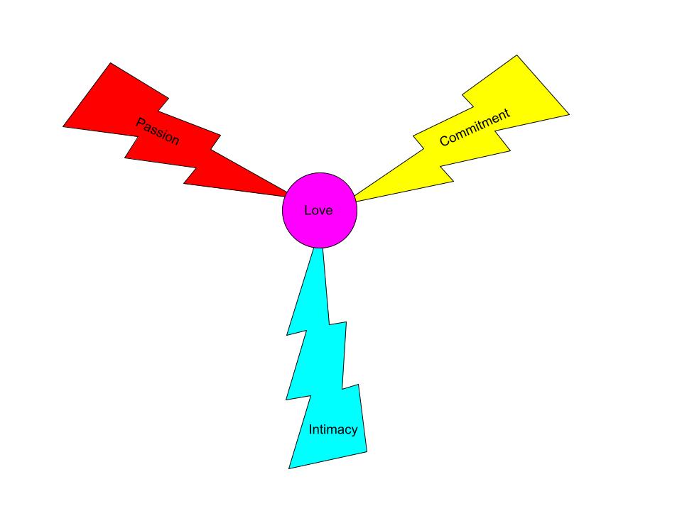
Once again, this graphic would serve as a supplement to a textbook such as Branscombe & Baron’s “Social Psychology” but this graphic nonetheless would aid students towards understanding the abstract interactions between Sternberg’s notions of passion, commitment, and intimacy.

The graphic I created to help students with understanding the triarchic dynamics of Sternberg’s Triangular Theory of Love is seen below:

I chose to use Google Drawing as my graphic design tool. The primary reading which supports my design is once again Mayer’s (2014) coherence principle. My design process involved the creation of a three-pronged lightning strike towards the center of the screen where ‘love’ emerges. I felt that by making each lightning bolt an independent color which I felt best represented the feelings of passion, intimacy, and commitment that the viewer would connect emotionally through the immediacy of the visuals (Dunlap & Lowenthal, 2016, p. 47).

Through adherence to Mayer’s (2014) coherence principle I created a graphic which avoided extraneous words and images. I also followed Clark & Lyons (2010) recommendation of making use of two-dimensional graphics rather than three-dimensional graphics since third-dimensional images have a negative propensity to create “extraneous mental load” (p. 15).

I hope this helps!

Carson  🙂

References

Clark, R. C., & Lyons, C. (2010). Graphics for learning : Proven guidelines for planning, designing, and evaluating visuals in training materials. Center for Creative Leadership.

Dunlap, J. C. & Lowenthal, P. R. (2016, September 8). Getting graphic about infographics: Design lessons learned from popular infographics. Journal of Visual Literacy, 35(1), 42–59. https://doi.org/10.1080/1051144X.2016.1205832

Mayer, R. E. (2014). Multimedia instruction. In J. M. Spector, M. D. Merrill, J. Elen, & M. J. Bishop (Eds.), Handbook of research on educational communications and technology (4th ed., pp. 385-399). Springer Science & Business Media. https://doi.org/10.1007/978-1-4614-3185-5

EDDL 5131: W5/6: Activity 2: Source Graphics for Educational Use

Hello everyone,

Learning Objective

“By the end of this unit, students will be able to create a short-essay that demonstrates a clear understanding of how the amygdala directly influences their emotional well-being”.

Infographic Link

https://www.flickr.com/photos/190553986@N08/50420143571

Connecting Infographics to Learning Objectives

This psychological infographic is creative common licensed according to Attribution-Non-Commercial-Share Alike 2.0 Generic (CC BY-NC-SA 2.0). This license signifies that I am free to share, copy, distribute, remix, or build upon this infographic as much as I desire so long as I give appropriate credit and indicate if I made any changes to the original infographic.

This infographic supports my learning outcome due to the fact that it concisely describes through the use of sub-headings how the amygdala is responsible for the emotions of human beings. For example, my chosen infographic clearly describes how the amygdala is responsible for fear response, anxiety response, aggression, and happiness.

Recommendations

While I enjoy how this infographic concerning the amygdala acts as the emotional center of the human brain, I would nonetheless use this image as a supplementary material alongside a required textbook such as Chance’s Learning and Behavior textbook. I believe that this infographic is sufficient as it is kept to only one page and connects visual content to written content effectively (Dunlap & Lowenthal, 2016, p. 45, 55). I also believe that my chosen infographic does an effective job of “directing learner attention” to the basic role of the amygdala in terms of producing emotions such as fear and anxiety which therefore supports one of the primary psychological events of learning (Clark & Lyons, 2010, p. 20).

Thanks for reading,

Carson 🙂

References

Clark, R. C., & Lyons, C. (2010). Graphics for learning : Proven guidelines for planning, designing, and evaluating visuals in training materials. Center for Creative Leadership.

Dunlap, J. C. & Lowenthal, P. R. (2016, September 8). Getting graphic about infographics: Design lessons learned from popular infographics. Journal of Visual Literacy, 35(1), 42–59. https://doi.org/10.1080/1051144X.2016.1205832

EDDL 5131: W4: Activity 6: No-Coffee

Hi everyone, I chose to use the Hinterland Who’s Who – Moose resource.

My Vision Impairment Experience

This was the first time that I used the No-Coffee Firefox extension and it was incredible to ‘see’ through a different set of eyes. Navigating through the various degrees of eye blur, contrast loss, glare, ghosting, and cloudiness brought the reality of accessibility to my heart and mind.

Of particular interest to me was how very little blur and cloudiness created a great amount of challenge in perceiving and understanding the Hinterland webpage. Going through this experience reminded me of the importance of web-design and how Hinterland’s use of a grey background rather than a white background added to the perceived blurriness that I experienced.

This activity reminded me of the importance of including audio and visual resources within any websites/blogs that I create. If someone cannot read my webpage, then they should at least be able to navigate towards audio resources as an alternative.

One significant problem I identified was that the only reason that I was able to identify where the YouTube video was on the Hinterland page was because of the bright red button which emerged. If this bright red symbol did not appear, I would have no idea that there was a video on the webpage.

I intend to implement larger fonts with bright-white backgrounds in order to create clear reading contrast. I also want to ensure that where I am able to, I will begin including audio/visual resources where applicable on my own writing website.

Carson 🙂

EDDL 5131: W4: Activity 5: Apply WCAG

Hi everyone,

The existing online resource which I used is Hinterland Who’s Who – Moose. 

Since the WCAG guidelines for accessibility directly refer to the POUR set of accessibility it was important for me to identify whether the Hinterland Who’s Who site was perceivable, operable, understandable, and robust.

POUR stands for:

Perceivable: Can materials be observed, heard or seen by learners?

Operable: Can learners interact with the site as intended?

Understandable: Is the site and associated media comprehendible by learners?

Robust: Does the site work across platforms (Windows and Mac, tablets or phones) and is it usable by assistive technologies like screen readers (Hyatt, 2012)?

Assessment of Hinterland Who’s Who Website

On first appearance, it is clear that the Hinterland Who’s Who site concerning the North American moose can be effectively read, heard, and seen since the site contains not only written materials but audio/visual materials which satisfies the perceivability component for accessibility.

Secondly, I was able to easily navigate the Hinterland webpage through the use of both my text-to-speech Chrome extension and through the use of my mouse and keyboard. In my eyes, the Hinterland webpage is very operable and satisfies the operability component for accessibility.

Thirdly, I was able to understand the Hinterland content concerning the North American moose as bullet points, headers, subheadings, photographs and audio/visual resources organized the basic description, habitat, feeding, breeding, and conservation of moose in a clear and concise way. I believe that the Hinterland webpage is thoroughly understandable and satisfies the accessibility requirement for understandability.

Finally, I was able to access the Hinterland Who’s Who webpage on both my PC and my cellphone which allows me to feel that the Hinterland webpage is robust across various platforms.

Conclusion

I believe that the Hinterland website would be an effective resource for my teaching practice since it effectively outlines an excellent model of not only a universal design for education but one which is accessible and interesting. While Hinterland is primarily a biology oriented website, I can nonetheless work at adapting the layout onto my own psychological interests if I were to create an online source for psychological or writing interests.

References

Hyatt, G. W. (2012, September 14). Surf a GB with Glenda’s thumb. Blog Accessibility. http://blogaccessibility.com/surf-a-gb-with-glendas-thumb/

Moose. Hinterland Who’s Who – Moose. (n.d.). Retrieved February 4, 2022, from https://www.hww.ca/en/wildlife/mammals/moose.html

National Center on Accessible Educational Materials. (2015, March 3). Simply said: Understanding accessibility in digital learning materials. YouTube. https://youtu.be/HzE5dj1WTSo

EDDL 5131: W4: Activity 2: Information Architecture

Bull Moose

Characteristics

animal antler big close up

Bull moose have antlers like other members of the deer family. Cows select mates based on antler size. Bull moose use dominant displays of antlers to discourage competition and will spar or fight rivals. The size and growth rate of antlers is determined by diet and age; symmetry reflects health.

The moose (North America), Alces Alces is a member of the New World deer subfamily and is the largest and heaviest extant species in the Deer family. Moose are distinguished by the broad, palmate (open-hand shaped) antlers of the males; other members of the deer family have antlers with a dendritic (“twig-like”) configuration. Unlike most other deep species, moose are solitary animals and do not form herds. Their mating season in the autumn features energetic fights between males competing for a female.

Habitat

black deer lying on plants near green trees during daytime

Moose also use young trees and shrubs as cover from predators, and protection from extremely hot or cold weather. Moose are cold-adapted mammals with thickened skin. They also have a dense, heat-retaining coat, and a low surface: volume ratio which provides excellent cold tolerance. Moose survive hot weather by accessing shade or cooling wind, or by immersion in cool water.

In hot weather, moose are often found wading or swimming in lakes or ponds. When heat-stressed, moose may fail to adequately forage in summer and may not gain adequate body fat to survive the winter. Also, moose cows may not calve without adequate summer weight gain. Moose require access to both young forest for browsing and mature forest for shelter and cover.

With reintroduction of bison into boreal forest, there was some concern that bison would compete with moose for winter habitat, and thereby worsen the population decline of moose. However, this does not appear to be a problem. Moose prefer sub-alpine shrublands in early winter, while bison prefer wet sedge valley meadowlands in early-winter. In late-winter, moose prefer river valleys with deciduous forest cover or alpine terrain above the tree line, while bison preferred wet sedge meadowlands or sunny southern grassy slopes.

Diet

light nature garden winter

Moose require habitat with adequate edible plants (e.g., pond grasses, young trees, and shrubs). Moose also require access to mineral licks, safe places for calving and aquatic feeding sites. Moose avoid areas with little or no snow as this increases the risk of predation by wolves and avoid areas with deep snow, as this impairs mobility. Thus, moose select habitat on the basis of trade-offs between risk of predation, food availability, and snow depth. The moose is capable of consuming many types of plant or fruit.

The average adult moose needs to consume 9,770 kcal (40.9 MJ) per day to maintain its body weight. Much of a moose’s energy is derived from terrestrial vegetation. The diet of a moose mainly consists of forbs and other non-grasses, and fresh shoots from trees such as willow and birch. A typical moose, weighing 360 kg (794 lb), can eat up to 32 kg (71 lb) of food per day.

Predators

gray wolf near rocks

The most common moose predators are the gray wolf along with bears and humans. Unlike most other deer species, moose are solitary animals and do not form herds. Although generally slow-moving and sedentary, moose can become aggressive and move quickly if angered or startled. Their mating season in the autumn features energetic fights between males competing for a female.

American black bears (Ursus americanus) and cougars (Puma concolor) can be significant predators of moose calves in May and June and can, in rare instances, prey on adults (mainly cows rather than the larger bulls). Wolverine (Gulo gulo) are most likely to eat moose as carrion but have killed moose, including adults, when the large ungulates are weakened by harsh winter conditions. Killer whales (Orcinus orca) are the moose’s only known marine predator as they have been known to prey on moose swimming between islands out of North America’s Northwest Coast. There is at least one recorded instance of a moose preyed upon by a Greenland shark.

Distribution

snow landscape mountain grass

In Canada there are an estimated 500,000 to 1,000,000 moose [58] with 150,000 in Newfoundland in 2007 descended from just four that were introduced in the 1900s. In the United States there are estimated to be around 300,000 moose. Russia, in 2007, had a population of approximately 600,000 moose. In Sweden, the summer population of moose is estimated to be 300,000-400,000 moose.

Conclusion

In the end, my strategy for this activity was to ensure that I used a white background with black text in order to create maximum contrast for ease of reading. I also ensured that each paragraph within this article contained only four sentences per paragraph. I used larger font for headers, large font for the subheads and I used a standard size font for the paragraphs. My use of photographs was kept pertinent to the content within this article as I only wanted to relate images to the content in a directly contextual way without undue distractions (Gutierrez, 2014; Webster, 2018).

It took quite a bit of editing to re-order this article in an effective way and my selection of headings reflects the topics I believed to be the most interesting and concise for a general overview of the attributes, life, diet, and population of moose.

Carson

References

Gutierrez, K. (2014, December 4). Keep eLearning readable or don’t bother using text at all [Blog post]. Shift: Disruptive eLearning. https://www.shiftelearning.com/blog/keep-elearning-readable-or-dont-bother-using-text-at-all

Webster, K. (2018). Text design for online learning. In, EDDL 5131 Multimedia in the Curriculum [Online course]. http://courses.olblogs.tru.ca/eddl5131-jan18/week-2-text/text-design-for-online-learning/
EDDL 5131: W3-Activity 3: Integrating UDL

Hi everyone,

Curriculum

a clear light bulb with many different thought bubble indicating how we should think and create a new piece of curriculum

Last semester I created a piece of curriculum for an entry-level course within colleges or universities. My psychology course was primarily written for those aged between 18 and 60 years of age.

Presentation

man in suit jacket standing beside projector screen conducting a PowerPoint presentation

The curriculum was primarily taught through the use of PowerPoint presentations where I used a voice-over to comment on the important sections of each slide. There were no significant educational pre-requisites to take the course beyond having a grade 12 diploma besides having basic artistic knowledge.

Subject

the hand of a psychologist is seen supporting a patient during counseling

The specific subject area of this piece of curriculum focused on human psychology. My psychology course was designed to be taught in-person but on account of the current COVID-19 Pandemic, I allowed for the course to be taught in a blended or full online method since each unit was presented using PowerPoint slides.

Expectations

a black and white dartboard with a yellow dart is pictured to indicate learning objectives

It was expected that between 15 and 30 students would attend my course in human psychology. The primary learning challenges presented to me revolved around whether some of my students lacked creative ability. It would be my interest to possibly re-shape the course to include poetic or written means of expression rather than singularly depending on drawing or art as an expression of learning.

a typewriter is seen indicating the process of editing curriculum

Best,

Carson 🙂

References

CAST. (2018). The UDL guidelines (version 2.2). http://udlguidelines.cast.org/

EDDL 5131: W3-Activity 2: Measuring Accessibility

Hello everyone,

Since I lack administrator access to WordPress I am unable to add alternative text for each image I choose to use for my articles. If I so desired to add videos to my articles, I would ensure that each video contains an option for captions. In addition, I believe that I am able to manage the perceivability of my website since each of my articles clearly contrasts between the black text and the white background. It is also obvious that none of my articles require a CAPTCHA. As a consequence, I believe that TRU’s use of WordPress and my use of WordPress as a publishing platform offers significant advantages in terms of high perceivability (Hyatt, 2012).

WordPress also allows readers to navigate webpages through keyboard-only navigation. It is also possible to publish articles which contain custom links rather than depending on an out-of-context hyperlink. I can do a more proficient job of providing headings throughout my articles as a means of increasing site operability (Cullipher, 2017; Hyatt, 2012). For example…

Is my website understandable?

My site’s language identified in the code assists text-to-speech software with correct pronunciation and I do my best to ensure that all complex definitions and acronyms are well-explained. I do my best to include images which assist with reader comprehension. However, I have failed to include summaries for lengthy articles and posts thus far. As a consequence, I can certainly do a better job of ensuring that I include article summaries (Hyatt, 2012).

Is my website robust?

Across all platforms my website performs well. The only issue that I identified is that because my blog through TRU is hosted as only viewable through those enrolled in this course, people outside of the course cannot access my blog from their computers or their cellphones. This is not an issue of robustness but is instead an issue of security and privacy preference (Hyatt, 2012).

In the end, I believe that the most effective changes I can make to my future blog posts will involve including more photographs throughout my writing so as to spurn creative connections. It would also be in my interest to continue using headings, videos, and alternative text for photographs to as to ensure that viewers using text-to-speech software are able to better connect to the course content (Cullipher, 2017). Overall, I feel that TRU’s use of WordPress as a publishing platform is an effective one.

Best,

Carson 🙂

References

Cullipher, V. (2017, June 7). Accessibility checklist. Digital Accessibility Digest. https://www.microassist.com/wp-content/uploads/2017/02/Microassist-Accessibility-Checklist-ACC.pdf

Hyatt, G. W. (2012, January 3). The POUR principles: The starting point for creating accessible blogs. Blog Accessibility. http://blogaccessibility.com/the-pour-principles-the-starting-point-for-creating-accessible-blogs/