

Hi everyone,
Original Photograph

I chose to use the open-source Gimp application. I chose to crop a photo of a Buddha statue which I felt contained quite a bit of extraneous and inconsequential background.
Cropped Photograph

I chose to focus on Buddha rather than the open-sky or the brick wall below since Buddha was the focal point who contains a lot of meaning in Buddhist tradition. It was important for me to ensure that I followed Mayer’s (2014) coherence principle since Mayer argues that readers and viewers of multimedia projects learn more readily when the images and written content avoids “extraneous material”. Since it would be my intention to focus on Buddha’s life within a piece of curriculum, including the open-sky would do little to add to my focal point.
Workflow Concerns
In the end, I felt that navigating and understanding how to use Gimp to crop an image was a somewhat indirect process since the cropping tool was not linear but required the use of a ‘snipping’ tool which took some getting used to. I also had a small amount of difficulty understanding how to save my cropped image in JPEG format since every time I tried to save my image it saved as a .XCF file. If you choose to use Gimp to edit your photographs ensure that you navigate to:
Select File > Export As.
Use the Export As box to assign a name and location to the image.
Click Select File Type to open the list of available file types.
Scroll down the list and select JPEG Image.
Finally, you can see my re-sized imaged below. This one is roughly 25% the size of the original cropped image I made above.

Activity 5: Create a Graphic
An old learning objective I created for a course pertaining to Sternberg’s Triangular Theory of Love is:
“By the end of this unit, students will be able to create a short-essay that demonstrates a clear understanding of Sternberg’s three principles of love”.
Once again, this graphic would serve as a supplement to a textbook such as Branscombe & Baron’s “Social Psychology” but this graphic nonetheless would aid students towards understanding the abstract interactions between Sternberg’s notions of passion, commitment, and intimacy.
The graphic I created to help students with understanding the triarchic dynamics of Sternberg’s Triangular Theory of Love is seen below:
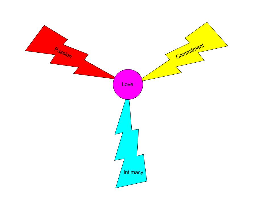
I chose to use Google Drawing as my graphic design tool. The primary reading which supports my design is once again Mayer’s (2014) coherence principle. My design process involved the creation of a three-pronged lightning strike towards the center of the screen where ‘love’ emerges. I felt that by making each lightning bolt an independent color which I felt best represented the feelings of passion, intimacy, and commitment that the viewer would connect emotionally through the immediacy of the visuals (Dunlap & Lowenthal, 2016, p. 47).
Through adherence to Mayer’s (2014) coherence principle I created a graphic which avoided extraneous words and images. I also followed Clark & Lyons (2010) recommendation of making use of two-dimensional graphics rather than three-dimensional graphics since third-dimensional images have a negative propensity to create “extraneous mental load” (p. 15).
I hope this helps!
Carson 🙂
References
Clark, R. C., & Lyons, C. (2010). Graphics for learning : Proven guidelines for planning, designing, and evaluating visuals in training materials. Center for Creative Leadership.
Dunlap, J. C. & Lowenthal, P. R. (2016, September 8). Getting graphic about infographics: Design lessons learned from popular infographics. Journal of Visual Literacy, 35(1), 42–59. https://doi.org/10.1080/1051144X.2016.1205832
Mayer, R. E. (2014). Multimedia instruction. In J. M. Spector, M. D. Merrill, J. Elen, & M. J. Bishop (Eds.), Handbook of research on educational communications and technology (4th ed., pp. 385-399). Springer Science & Business Media. https://doi.org/10.1007/978-1-4614-3185-5
Hi Carson,
I agree that GIMP isn’t the most intuitive tool for cropping an image but it does have similar capabilities to Adobe Photoshop so worth getting to know. I’ve stuck with it since I started teaching in this program as I wanted to be familiar with free tools.
I like the visual representation you’ve done for Sternberg’s theory. I think when you create a version to use online you will need to look at the specific placement and see if the text describing each component is readable based on the image size.
I suspect the colours associated with each element are going to be culturally informed. It would be interesting to see what colours a large group of students chose if they were redesigning the graphic themselves.
An advantage of using a layer-based tool for an image like this is that layers allow you to maintain different versions within the source file, and then export the version you need. So you could have one with larger text, or one with different colours.