Hi everyone,
-Drama of the Amygdala-

Learning Outcome
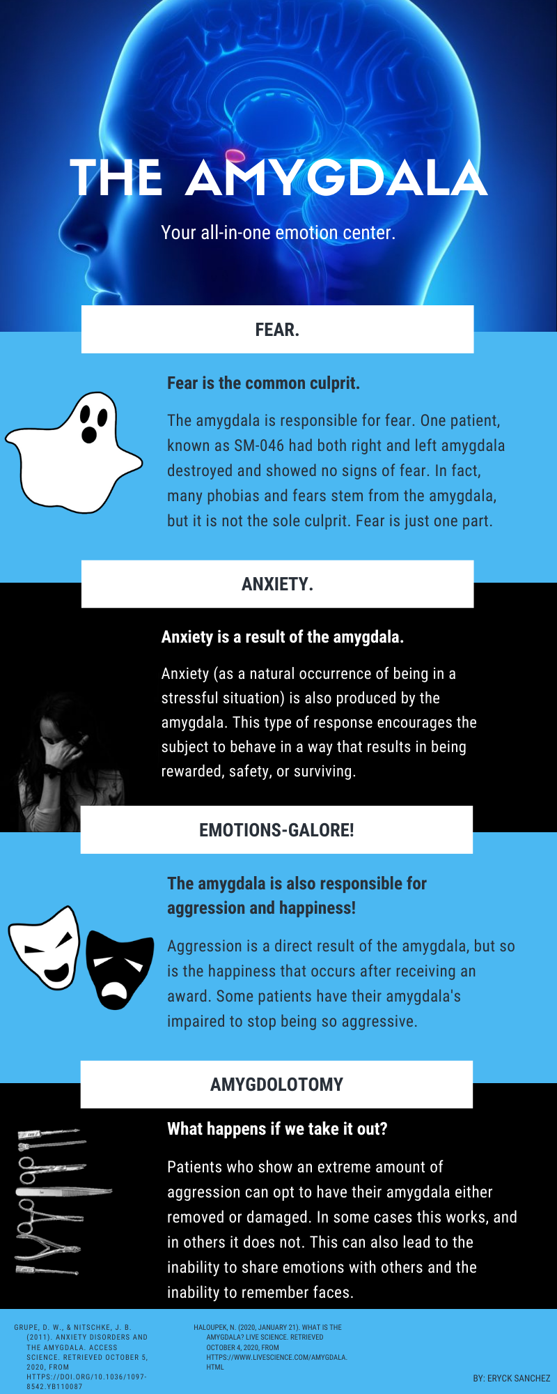
Upon completion of a brief study of the amygdala infographic it will be each student’s responsibility to ensure that they are capable of describing at least three emotions with examples which the amygdala is responsible for producing.
Intended Audience
This infographic would be directed towards the learning of first-year psychology students who are taking an introduction to psychology course. Age-group would be 18 years of age and up with no educational pre-requisites aside from documentation of a GED or Grade 12 diploma.
Theoretical Underpinnings
By surrounding my sourced amygdala infographic with a title, a brief caption, and a learning outcome, I am better able to support student learning through greater adherence to Clark & Lyons (2010) notion of interpretive graphics whereby my infographic displays the general location of the amygdala within the human brain and how it explains invisible emotional processes within the human brain (p. 19).
This infographic also allows students to only focus on one learning outcome while simultaneously creating compellingness since the infographic effectively “propels the learner through the content via a succession of related ideas” surrounding emotions (Dunlap & Lowenthal, 2016, p. 48, 55).
Best,
Carson 🙂
References
Clark, R. C., & Lyons, C. (2010). Graphics for learning : Proven guidelines for planning, designing, and evaluating visuals in training materials. Center for Creative Leadership.
Dunlap, J. C. & Lowenthal, P. R. (2016, September 8). Getting graphic about infographics: Design lessons learned from popular infographics. Journal of Visual Literacy, 35(1), 42–59. https://doi.org/10.1080/1051144X.2016.1205832


Hi Carson
Nice infographic.
Interesting choice of colours, and good contrast within the text portions. Engaging graphics for each of the segments.The only suggestion I could make it that the photo in the third section is bit hard to see against the black background.
Thanks
Jim
Hi Carson,
This is a pretty good infographic. Often for an infographic quite a bit of text is needed to offer the same result as viewing the image. I believe you get 256 characters for the alt/title field.
I would suggest having a larger size of the infographic available if you click on the displayed image.
Hi Carson,
What an interesting infographic on the amygdala! I like the title image highlighting the location of the amygdala in the human brain. I also like how the design of the segments in the infographic helps chunk the information into manageable snippets.
Some changes I would make to the design of the graphic to improve readability include:
-larger size graphic, which will also increase the font;
-contrast of white background with black font (instead or the reverse);
-punctuation corrections (e.g., the two top subheadings do not need periods, amygdalas does not need to be possessive in the fourth paragraph, etc.); and
-removal of irrelevant information to reduce extraneous processing (e.g., students probably do not need to know the case number of patient SM-046).
Best,
Gena